
From relationships between food intake and allergic reactions, to the photochemical spectra of molecules in solution, data is an integral part of every STEM field. However, our puny little human brains cannot decipher trends in datasets from merely studying tables and tables of data: we need to visualize it!
It is safe to say that the visualization, or in other words the communication, of data to others in your field or to lay people is the single most important aspect of any research endeavor. Without this vital connector in the research pipeline, nothing can result from your intricately planned and executed experiments.
With data visualization being this important, you may ask “How do I go from raw data to a beautiful figure?”. Well I can promise you that a spreadsheet software like Microsoft Excel is not the answer. No matter what point you are at in your career, I suggest that you drop whatever data visualization tools you are using, and transition over to using Python and Matplotlib immediately.
You may be thinking to yourself “But I have no idea how to program…”. Well I am here to tell you that you need zero experience in programming to be able to use Python to visualize your data. I will show you how to go from your excel spreadsheet or text file of rows and columns of data to a completely customized publication quality figure, and I promise you, you will be hooked just like I was when I started.
This post is designed for the beginner to python data processing, so I will be walking you through the entire workflow. If you already have some prior knowledge or experience and are here instead to learn about how to customize your data plots you can skip to the "Making Advanced Plots" section.
One last note before I go on. I always give both the Mac OS and the Windows commands for anything that is operating system dependent in my blog posts, so look for this style text for Mac OS or this style for Windows whenever I introduce a new concept.
First, you need to install Python 2. To note, there is also Python 3, however I use Python 2 for several reasons I won’t get into here. The versions are quite similar with only slight differences in syntax and package compatibility. To download Python 2, I recommend downloading it from Anaconda. Once you have this downloaded, you then need to launch Jupyter Notebook.
Jupyter is an interactive way of using python. Instead of using the command prompt (which can be intimidating to beginners) to code programs which run in one-shot and then need to be de-bugged a rerun, Jupyter instead allows us to run one piece of the code at a time, carefully making sure it works.
To launch Jupyter, press command and space together, then type “terminal” and press enter OR press the windows button, then type “command prompt” and press enter. If you want to make your computer use exponentially more efficient, then terminal or command prompt should become your best friend. I believe this so much so that I designed my blog in a command prompt/terminal/bash style. I will get into more of the importance and utility of terminal and command prompts in a later post, but for now you can admire it’s beauty from afar.
Jupyter will then launch as a new tab in your default browser. I recommend using Google Chrome. You will notice that there is a list of all of your directories that are within the directory you launched Jupyter from, likely your user directory. (FYI, “directory” means “folder”, but I will always refer to it as a directory). I recommend creating a new directory for your Python work within your documents folder. Of course, you could open up youfinder or file explorer, but working in the terminal is much more fun! To do this, open terminal or command prompt, type cd Documents, press enter, then type mkdir [DIRECTORYNAME] and enter again. You now have a new directory with name [DIRECTORYNAME] inside your documents directory! Congrats!
Within Jupyter, navigate yourself to your new directory, and then press “new>Python 2” in the top right corner. I recommend adopting a common naming convention for all of your files, including your name and initials, so I would name this something like “SampleGaussianPlot_181101_EGR”. We call these files we make in Jupyter “notebooks”, because as you will see we can add notes to all of our data and nicely go back to these files and work on them. This means that these files will have the file type “.ipynb”, which stands for interactive python notebook. Now that we have our first notebook file, let’s get to work on processing some data in Jupyter.
The first thing we need to do in Jupyter is import the modules that we will be working with. These are files with lots of pre-coded functions which we can easily call. This means we don’t have to hard-code how to, for example, open a .csv file everytime we want to open one. You can probably see the importance of this, if not then you will soon.
However, we first want to make sure that we have the modules we want downloaded, and that the versions are the correct versions. To do this, we again need to open our hand-dandy terminal! (Seeing a trend yet?) We are going to use something called “pip” to install our packages. We will be installing two packages: (1) matplotlib and (2) numpy. The former is a plotting package which we will use to make gorgeous figures, and the latter is the modern version of something called “Numeric”, and has lots of functions for numerical computing, which python isn’t the greatest at on its own.
First, type “pip uninstall matplotlib”, and then “pip uninstall numpy”. After those two are completed, type “pip install matplotlib==2.0.0” followed by “pip install numpy==1.14.5”, to make sure you are working with the same versions as this tutorial. By writing “==#.#.#” after the package name, we tell pip to install that specific sub-version of the package. Hooray! Now we have our packages installed. Now to import them to our notebook.
Go to the first cell of the notebook (i.e. the first little box beneath the toolbar), and type in the following:
import matplotlib
import matplotlib.pyplot as plt
import numpy as np
We import these packages and call them something short, like “plt” and “np”. There are a few more features we are going to want, so we will import a few more sub-packages. In the next cell, enter:
from matplotlib.ticker import AutoMinorLocator
from matplotlib import gridspec
import matplotlib.ticker as ticker
%matplotlib inline
Now that we have our packages imported, we are ready to read in some data!
For sake of example, I created a fake dataset which is just a single gaussian curve over a range of wavelength values (i.e. a Fluorescence Spectra). You can download that file in my GitHub repository “BlogRepo”, here. Download the file “SampleGaussianData_181101_EGR.csv”, and place it in your new directory (the same one that your .ipynb file is in for simplicity, but really it doesn’t matter). You can move files with the terminal without having to move your hands from the keyboard, but I’ll save that for another post.
We next need to assign the path of the file to a variable called “path”, which will look something like this:
path = "C:/Users/Emily/Documents/[DIRECTORYNAME]/SampleGaussianData_181101_EGR.csv"
Also, if you open up this data file in excel, you will see that there are headers for each column. We need to let Python know that these are here and that they aren’t data. We can do this by first assigning the number of header rows to a variable:
numberHeader = 1
We are now ready to read in the data. We will use a function from the numpy library called “genfromtxt” which does exactly what it sounds like it does.:
data = np.genfromtxt(fname=path,
delimiter=",",
skip_header=numberHeader)
Now we have our data assigned to the variable “data”. Our data consists of two columns of data, an x-axis and a y-axis. I want to separate these into two variables called “xAxis” and “yAxis”.:
xAxis = data[:,0]
yAxis = data[:,1]
The lines of code above take (1) the first column of the data (data[:,0]) and assigns it to the xAxis, and (2) the second column of the data (data[:,1]) and assigns it to the yAxis. The data is what we call an array, and I will delve into this in a future post as well. Now that we have this code written, we can plot a very basic plot by entering the following:
plt.plot(xAxis, yAxis, "r")
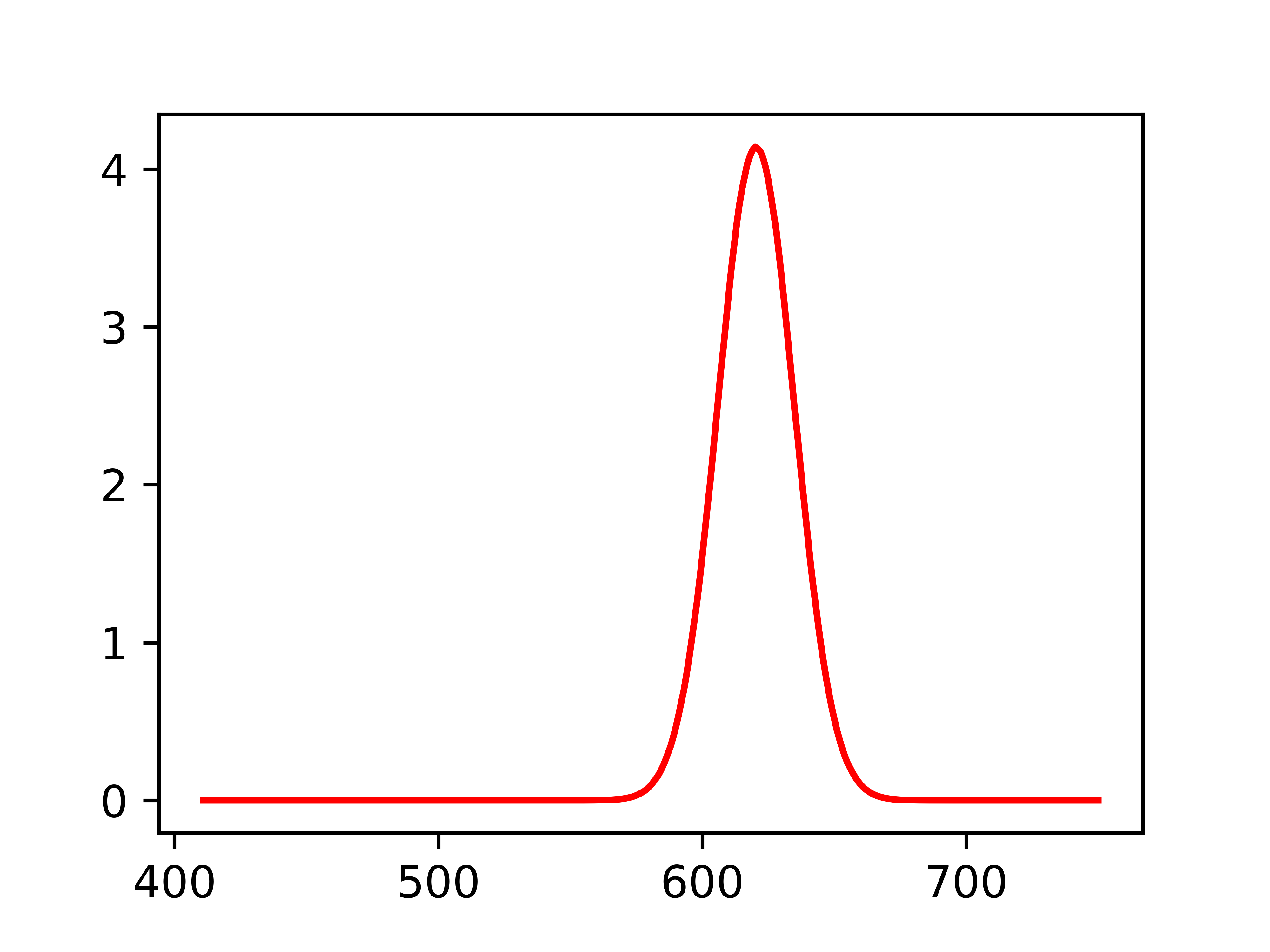
As you can see, this is not a very fancy plot, certainly not publication quality, let alone something you would want to show your friends. So let’s take it up a notch.
First, we need to pick a color for the plot. I’m going to choose a nice neon green, however you can change the color by changing the value after the hashtag to a new hex-value by using a website like this.
plotColor = "#09FD02"
We can also change things like the axis limits, tick frequency, labels, fill under the curve. There are a lot of options. Here I am going to show an example which you can play with all the parameters to better suit your data. I added comments (lines of code starting with “#” are comments) before each line of the following text to help you understand how to manipulate the variable more.
# Here we assign the size of the figure, and can add subplots
fig = plt.figure(figsize=(4,3))
gs = gridspec.GridSpec(1,1)
ax1 = fig.add_subplot(gs[0])

# Plotting the data
ax1.plot(xAxis, yAxis, color=plotColor)

# Filling under the curve
ax1.fill_between(xAxis, yAxis.min(), yAxis, facecolor=plotColor, alpha=0.3)

# Setting the axes limits
ax1.set_xlim(500, 700)
ax1.set_ylim(-0.1, 5.4)

# Axes labels
ax1.set_xlabel("Wavelength (nm)",family="serif", fontsize=12)
ax1.set_ylabel("Intensity (au)",family="serif", fontsize=12)

# How often plot a major tick mark
ax1.xaxis.set_major_locator(ticker.MultipleLocator(50))
ax1.yaxis.set_major_locator(ticker.MultipleLocator(1))

# How many minor tick marks are between each major tick mark
ax1.xaxis.set_minor_locator(AutoMinorLocator(2))
ax1.yaxis.set_minor_locator(AutoMinorLocator(2))

# Setting tick mark lengths, and putting them on both sides of the plot
ax1.tick_params(axis='both',which='major', direction="out", top="on", right="on", bottom="on", length=8, labelsize=8)ax1.tick_params(axis='both',which='minor', direction="out", top="on", right="on", bottom="on", length=5, labelsize=8)

# Making sure none of our plot gets cut off
fig.tight_layout()

# Saving the figure
fig.savefig("SampleGaussianPlot_181101_EGR.png", format="png", dpi=1000)
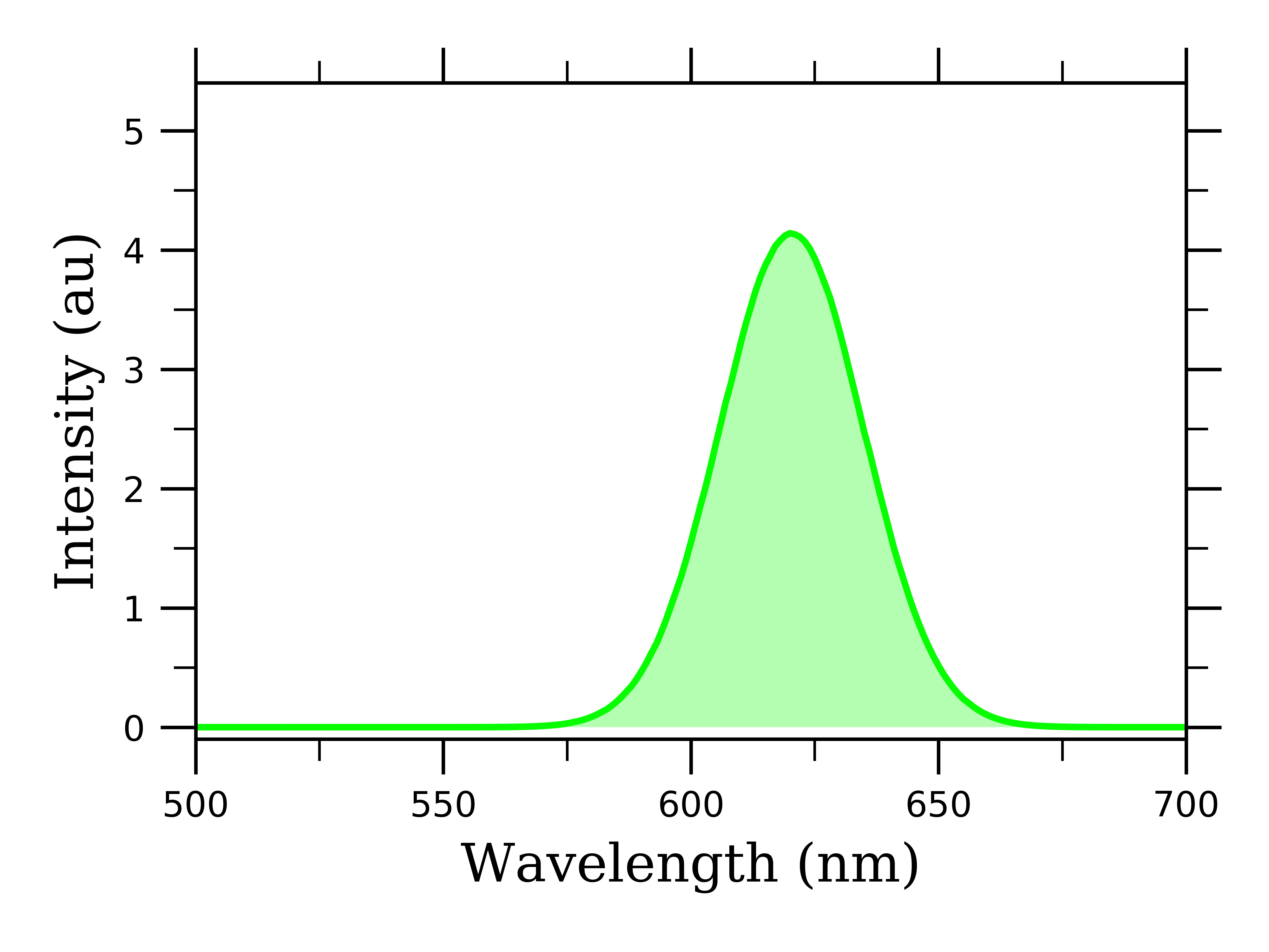
What is important to note is that we are saving this as a super high-quality image format, “format="png", dpi=1000”. This will allow you to zoom in crazy close on the figure without blurriness. This is great for powerpoints, poster presentations, or publications.
Clearly, I have not even scratched the surface of what matplotlib can do to help us visualize data. However, I hope that I helped you develop some skills to go out and find more solutions to your data visualization needs. I will continue to blog about ways to work with more complicated data, so stay tuned for more!
For reference, I am using the following package versions:
Python (2.7.14) | matplotlib (2.0.0) | numpy (1.14.5)
All thoughts and opinions are my own and do not reflect those of my institution.